Let’s be honest, most business owners don’t care if their website just looks good. A sleek design is nice, but if it’s not bringing in phone calls, leads, or sales, it’s basically digital wallpaper. What you actually need is a website that pulls its weight and drives results.
The good news? You don’t always need to start from scratch or hire a big design and development team. By making a few simple and easy tweaks, you can see a noticeable jump in conversions. But before we get into the how, let’s talk about the who.
Why Buyer Personas (and Negative Buyer Personas) Matter
Every website is built for someone, your ideal customer. That’s where buyer personas come in. They’re detailed profiles of your best-fit customers based on real data, behavior, and goals.
But here’s the twist: you should also know what a negative buyer persona is. That’s the person you don’t want to spend time and money attracting. For instance, if you run a premium web design agency, your negative buyer persona might be DIY business owners who just want a free template. They’ll eat up your time, but they’ll never pay for your service.
From a design point of view, keeping both personas in mind is very crucial. Every headline, button, and form on your website should pull in the right people while gently pushing away the wrong ones.
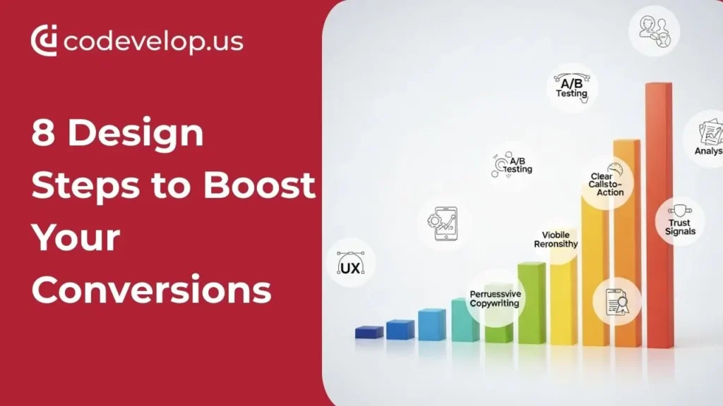
Let’s move into the eight design steps that can give your conversions a serious lift.
1. Use Clear and Compelling Headlines
Think about how you scan a website. Do you read every word? Of course not. You skim. That’s why headlines are the make-or-break moment.
A headline like “Welcome to Our Website” says nothing. But “Green Bay Web Design That Converts Visitors Into Clients” instantly tells visitors what you do and why it matters.
Pro tip: Always put your main/focus keyword in the headline (make sure you are not stuffing it). This will not only help your reader, but it also gives Google a clear signal about your page’s focus.
2. Simplify Your Navigation
Website menus are like road signs. If there are too many, you’ll confuse your drivers. If there are too few, they’ll miss their exit.
I once worked with a local roofing company whose navigation had nine dropdowns under “Services.” Customers were lost before they even got to the contact page. Once we trimmed it down to four clear options, calls nearly doubled.
Simple, predictable menus = less frustration, more conversions.
3. Focus on One Clear CTA Per Page
Here’s a mistake I see all the time: a page with five different calls-to-action. “Download this guide,” “Sign up for a newsletter,” “Book a call,” “Read our blog.” Visitors don’t know which way to go, so they do nothing.
Instead, give each page one job. If it’s a service page, maybe the goal is “Schedule a Consultation.” If it’s a single blog post, maybe “Download the Checklist.” Keep the Call To Action clear, repeat it a couple of times, and make sure all the button text is benefit-driven.
4. Speed Up Your Website
Nobody waits around for a slow website. If your page takes more than three seconds to load, you’ve already lost a big chunk of your audience.
Images are the usual culprit. I’ve seen sites upload massive 5MB photos straight from a camera; no wonder it takes forever to load. Tools like TinyPNG or WebP formats can fix this fast.
Fast websites not only make visitors happy but also improve SEO rankings. Google rewards speed because it knows users demand it.
5. Make It Mobile-Friendly
Quick reality check: more than half of your visitors are probably on a phone. If your site isn’t mobile-friendly, you’re leaving money on the table.
That means no tiny buttons you can’t tap, no squished text, and no layouts that require pinching and zooming. A responsive design that adapts to different screen sizes isn’t optional anymore; it’s a must.
Think about it: would you buy from a site that feels broken on your phone? Neither will your customers.
6. Add Trust Signals
Conversion is built on trust. If people don’t believe you’re credible, they won’t click that button. Period.
Add customer reviews, testimonials, or case studies. Show photos of your real team, not just stock images. If you’ve won awards or been featured in the local news, highlight that.
One of my favorite examples is an “As Seen On” section with logos of trusted publications. It instantly makes a small business look established and reliable.
7. Write SEO-Optimized, User-Friendly Content
Good content is about balance. It should speak to humans first, but also keep search engines in mind. That means answering common customer questions, using your primary keywords in strategic spots, and weaving in related terms like conversion optimization, website design best practices, digital marketing strategy, etc.
And here’s the kicker: writing content that naturally filters out your negative buyer personas saves you headaches. If your service isn’t cheap, say so upfront. If you work only with local clients, make it clear. You’ll attract the right audience and avoid wasting time on the wrong one.
8. Make Forms Simple and Friendly
Finally, let’s talk about forms, the finish line of many conversions. If your form looks like a government tax document, no one will fill it out.
Keep it short. Ask only for what you truly need. A name, email, and maybe one optional message box are often enough. Use friendly copy like “We’ll get back to you within 24 hours” instead of robotic instructions.
And please, ditch the word Submit. Nobody feels excited to “submit.” Use buttons like “Get My Free Quote” or “Start My Project.”
Wrapping It Up
Boosting your website conversions doesn’t require a total redesign or thousands of dollars in software. Often, it comes down to making things clearer, faster, and more trustworthy.
To recap:
- Use strong, keyword-rich headlines.
- Simplify your navigation.
- Stick to one CTA per page.
- Speed up your site.
- Make it mobile-friendly.
- Add trust signals.
- Write content that balances SEO and user needs.
- Keep forms short and friendly.
And don’t forget, design isn’t just about who you want to attract. It’s also about who you don’t. Knowing your buyer persona and understanding what a negative buyer persona is will help you focus your design on the people who actually matter.
Your website should be more than just a pretty brochure. Done right, it becomes your hardest-working salesperson, one that never sleeps and never takes a day off.
Want a website that actually brings in leads, calls, and sales? 🚀 Let Codevelop design a conversion-focused website for your business.